Features Components for React & Next.js
Highlight key offerings using 102 feature components for React, crafted with Tailwind CSS to enhance any Next.js interface.
Browse components


Grid Feature Cards
1.8K

Feature Sections
105

Features 8
3K
Features 3
56
Feature Modern
20
Features 2
318
Feature with image
148
Features Card
196
Feature Section with card gradient
169

Feature 72
122

Features Grid
78
Feature with advantages
278
Bento Feature Grid
25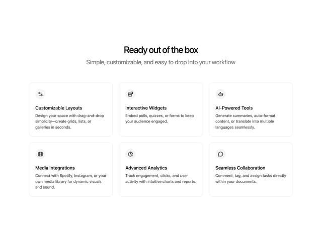
Features Grid
25

Ruixen Feature Section
228
Bento
1.1K
Blog 7
292
Integrations Grid
528
Feature 1
117
Tabbed Feature Categories
54
Feature Problem Cards
81
Ruixen Bento Cards
433
Stats Section with Text
458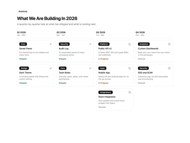
Quarterly Roadmap Columns
46
Features 4
363
Features 1
277
Integrations Section
551
Feature 2
76

Feature Section
1.7K
Comparison Section
56
Feature Section with Bento Grid
400
Feature Overview Bento
22
Feature 73
73

Framework Agnostic
63
Bento Grid Hero
19
Integrations Card Grid
229
Feature Tab Switcher
23

Modal Card
98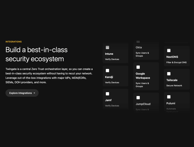

Animated Section
24
Color Change Card
758
PARALLAX SCROLL FEATURE SECTION
1.2K
How It Works
1.7K
Interactive Feature Section
70
Feature Section with hover effects
1.9K

Feature Card
661
Globe Feature Section
853
Content Block
4
Bounce card features
568


Keep browsing with a free account
See all 12,000+ components, 286 templates, 933 themes and 138 apps, save favourites and copy two prompts a day for free. No card needed
More features components
- Feature Sections by prebuiltui
- Feature Modern by brijr
- Feature Sections by prebuiltui
- Feature Modern by brijr
- Card with Ellipsis Pattern by Indie UI
- Animated Features Bento with Live Diagrams by Kedhareswer Naidu
- Features by Méschac Irung
- Feature Velocity by ui layout
- Automation Bento Grid by ShadcnSpace
- Featured Image Section by Ruixen
- Content Section by Méschac Irung
- RuixenCard-01 by Ruixen
- How We Do It - Process Overview by Ravi Katiyar
- Feature Showcase by Ruixen
- Feature Highlights Grid by uiable
- Service Grid by Ravi Katiyar
- Feature Grid by LaviKatiyar
- Gradient Card by Ravi Katiyar
- Feature Carousel by 0xUrvish
- Sticky scroll cards section by Le Thanh
- Bento Grid by Shadcnblocks.com
- UltraQualityShowcaseGrid by Dhileep Kumar GM
- Features With Panel by scrollxui
- Feature Grid Spotlight Cards by Mohammad Shehadeh
- Feature Sections by prebuiltui
- Feature Modern by brijr
- Content Block by Méschac Irung
- Features 9 by Méschac Irung
- Features by Méschac Irung
- Featured Section Stats by Ruixen
- Scroll Reveal by Cnippet
- Services Card by Ravi Katiyar
- Feature 108 by Shadcnblocks.com
- About by prebuiltui
- Feature Bento by ui layout
- Dark Grid by Liana Pepanyan
- bento grid 01 by Awanish Verma
- Sticky Scroll Reveal by Manu Arora
- AI Feature Showcase Section by ShadcnSpace
- Icon Feature Grid by felipemenezes098
- Animated Feature Card by Ravi Katiyar
- How It Works by Ravi Katiyar
- Tabs Illustration Vercel by cult/ui
- Feature Accordion Section by Ruixen
- Pricing Cards by Kokonut UI
- Feature with Image Carousel by Tommy Jepsen
- Halo Reel by Ruixen
- Product Feature Card by Kavi Katiyar
- Feature Sections by prebuiltui
- Feature Modern by brijr
- Content Block by Méschac Irung
- Features by Méschac Irung
- Scroll Reveal by Cnippet
- About by prebuiltui
- Subscription Screen by Ravi Katiyar
- Download Options Section by Ravi Katiyar
- Feature 197 by Shadcnblocks.com
- Spotlight Card by Preet Suthar
- Bento Product Features by Kavi Katiyar
- Comparison Slider with Highlights by uğur sözen
- Card by LaviKatiyar
- Scroll Reveal Content A by abui
- Grid Card by Efferd
- Portfolio Scroll Grid by Ruixen
- Squeeze Carousel by Yura Dubinin
- Feature Shader Cards by Jessi
- featuresgrid by Gujjeti Mokshith
- Feature Section by Ravi Katiyar
- Feature Card by LaviKatiyar
- Feature Section by Ruixen
- FeaturesDetail by Ruixen
- Financial Platform Feature Grid by uiable
- Feature Sections by prebuiltui
- Feature Modern by brijr
- Content Block by Méschac Irung
- Features by Méschac Irung
- About by prebuiltui
- Multi-Platform Download Grid by ShadcnSpace
- Services by Ravi Katiyar
- Features by Cnippet
- Interactive Scrolling Story Component by Le Thanh
- Bento Grid by Manu Arora
- Standard Card by Ranjan Sharma
- Magnified Bento by 0xUrvish
- Scroll 01 by felipemenezes098
- Alternating Rows With Stats by Oliver
- Bento Grid by Ravi Katiyar
- Animated Card Diagram by badtz
- Feature by Jessi
- Scroll Reveal by Cnippet
- Category List by Vaibhav Kumar Singh
- Gallery Hover Carousel by Ruixen
- Bento Grid by LaviKatiyar
- Milestone Timeline Feature by uiable
- App Download Section by Ravi Katiyar
- Special Card by reuno-ui
- Feature Sections by prebuiltui
- Feature Modern by brijr
- Features by Méschac Irung
- About by prebuiltui
- Service Card by LaviKatiyar
- Bot Detection by Aman Shakya
- Cards Grid by Kavi Katiyar
- Integration Showcase by Ravi Katiyar
- Feature Card by Berat Berkay Gökdemir
- Colorful Bento Grid by Radu Popescu
- Feature Highlight Card by Ravi Katiyar
- Feature Carousel by cult/ui
- Hero by Sam sir
- Combined Featured Section by Ruixen
- hero-section by ui layout
- Cybernetic Bento Grid by Dhileep Kumar GM
- Testimonial Card by Ravi Katiyar
- Layer Parallax Hero by Erik Erik
- settings by LN
- Bento Monochrome by 21st
- About Page by Ruixen
- Hero 45 by Shadcnblocks.com
- Us vs Them Comparison by Oliver
- Feature with Image Comparison by Tommy Jepsen
- Feature Sections by prebuiltui
- Feature Modern by brijr
- Features by Méschac Irung
- Feature Section by Ravi Katiyar
- Feature Spotlight by Ravi Katiyar
- Hero by Ravi Katiyar
- Animated Feature Carousel by Le Thanh
- Bento Monochrome 1 by 21st
- Highlight Card by Berat Berkay Gökdemir
- Feature Comparison Table by Oliver
- Hero Section by Dhileep Kumar GM
- Bento Features by 21st
- Single Pricing Card by Bankk roll
- Bento Grid by Ali Imam
- Feature Hero by ui layout
- Feature Block Animated Card by Manu Arora
- StackFlow Integrator by Sam siavoshian
- Feature Highlight Pro Card by Ruixen
- Myna Hero by Bankk roll
- Feature Sections by prebuiltui
- Features by Méschac Irung
- Features by Méschac Irung
- Features by Méschac Irung
- Features by Méschac Irung
- Feature Card by Ravi Katiyar
About features components
This collection holds 199 feature components for laying out what a product does. You get bento grids, icon-and-text rows, alternating image splits, tabbed showcases, and card layouts that scale from three items to a dozen. Styles run from clean enterprise sections to playful animated blocks. It is the section that sits below the hero and carries the bulk of a page's message, so variety in rhythm and density matters here.
Choose a bento grid when features differ in weight and a uniform card row when they are peers. Each piece is React plus Tailwind CSS, ready for a Next.js page without setup. Grab the TSX from the source view, install through the shadcn CLI with the registry URL, or pull it into your editor via the Magic MCP. Pair it with a matching hero and pricing block for a coherent page.